library("XML")
library("methods")
library("tidyverse")
library("lubridate")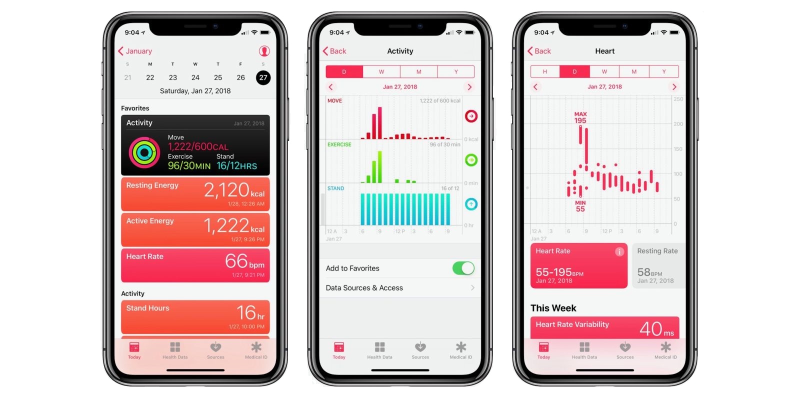
As sports scientists during the COVID-19 shutdown, we have limited ways of determining adherence to training programs (completed within govenment guidelines of course!).
Data from smart watches provide practitioners with basic measures that can be used as a rough guide to quantify training over this period (when using the more sophisticated technologies isn’t possible).
Although the reliability and validity data of these devices aren’t widely available, they provide basic metrics such as total distance, duration, heart rate, and energy burnt etc.
In this post I’ll run through how to:
- export this data without an API
- run some some basic analysis
- manipulate and visualise the data using
dplyr&ggplot
You can find presentation slides covering all content and the full code at the end of the post.
Accessing Apple Health data
Step 1
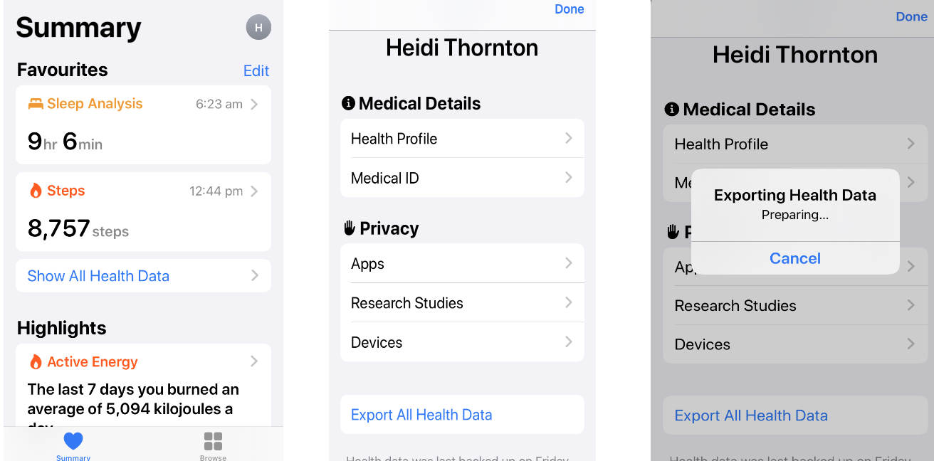
Open the Apple Health app on your phone, then summary page at the top right, then tap the circle showing the first letter of your first name on the top right (left figure above).
Step 2
Slide down and tap ‘Export All Health Data’ (middle figure).
Step 3
The export takes up to a few minutes, then a page to email or message it will pop up. Email this file to yourself and download it.
If you don’t have an Apple watch and want to use my data, you can download my .xml file here.
Opening Apple Health data
You can open the .zip folder directly using R, however for this project I’ll manually extract the file within the folder named apple_health_export.
Inside, there’ll be 2 files. For our purposes, you only need the export file.
I’ve made a new folder that houses all files, and this is where my working directly will be set. In Rstudio, I’ll create an R script and load the packages I need. If you don’t have these packages installed use install.packages("packagename") before loading them with library().
Why do this in R?

R is reproducible | Microsoft Excel is not
We could simply export the raw data into Excel and manipulate / visualise it there, but R isn’t that difficult, and there are lots of resources out there to help learn it.
Have the end game in mind.
Import the data into R
The file format (XML; Extensible Markup Language) is quite easy to work with in R using the XML package.
If you have multiple .xml files you can use a loop to access them all - I’ll only be using one file for this example and it’s saved in my working directory.
First, we need to make an object that I’ll call xml and view it’s contents using summary(xml).
xml <- xmlParse(paste("heidi-thornton_apple-data.xml"))
summary(xml)
$nameCounts
Record Workout MetadataEntry ExportDate HealthData
200264 202 70 1 1
Me
1
$numNodes
[1] 200539View the data
I’m interested in the workout data. We can open this using xmlAttrsToDataFrame().
df_workout <-  XML:::xmlAttrsToDataFrame(xml["//Workout"])[c(1:2, 4, 6, 12)]
head(df_workout, n = 5) # View the top 5 rows of data
workoutActivityType duration totalDistance
1 HKWorkoutActivityTypeRunning 42.44751790364583 8.01347998046875
2 HKWorkoutActivityTypeCycling 45.69051513671875 11.1736796875
3 HKWorkoutActivityTypeOther 45.29886474609375 3.60589990234375
4 HKWorkoutActivityTypeOther 58.97060139973959 1.7677099609375
5 HKWorkoutActivityTypeRunning 39.55806477864584 4.17927978515625
totalEnergyBurned endDate
1 2041.792 2019-11-23 06:40:35 +1000
2 1096.208 2019-11-24 06:56:26 +1000
3 836.8 2019-11-24 15:27:41 +1000
4 736.384 2019-11-25 05:27:23 +1000
5 669.4400000000001 2019-11-25 16:42:42 +1000Here we have the session type and the respective data for each day (in need of some cleaning).
Plotting data
Lets start by filtering so only the data I want to plot remains.
We will use %>% (pipes) from the tidyverse package perform this as it’s much quicker than making new data frames for each plot, and we’ll plot the data using ggplot2.
Daily running sessions
df_workout %>%

    # Change data types (i.e. distance to m not km, numeric)
      mutate(
        workoutActivityType = as.character(workoutActivityType),
        totalDistance = as.numeric(as.character(totalDistance))*1000,
        duration = as.numeric(duration),
        endDate = as.Date(endDate)) %>%

    # Only running sessions- depending on watch the name may differ
      filter(workoutActivityType == "HKWorkoutActivityTypeRunning") %>%
      filter(endDate >= "2020-03-23") %>% # only after shut down

# Create ggplot
ggplot(aes(x= endDate, y = totalDistance)) +
    geom_bar(stat="identity", fill='#5ab4ac')+
    labs(title = "Not exactly periodised, but it's better than nothing....",
           subtitle = "Daily running volume (m)",
           x = "Date",
           y = NULL) +
    scale_x_date(date_breaks = "7 days",
                   date_labels = "%b %d") +
    scale_y_continuous(expand = c(0, 0)) +
    theme_minimal() +
    theme(panel.grid.minor = element_blank(),
        panel.grid.major.x = element_blank(),
        axis.line.x = element_line(colour = "black", size = 1),
        axis.title = element_text(face = "bold"),
        plot.title = element_text(face = "bold"))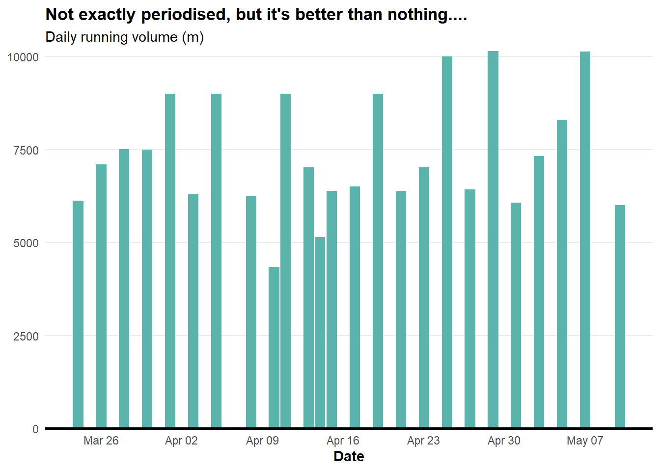
Now we have our first plot showing my running over the days after the COVID shut down.
Weekly running volume
We need to manipulate the data a bit more to get the weekly running volume.
df_workout %>%

   mutate(
    workoutActivityType = as.character(workoutActivityType),
    totalDistance = as.numeric(as.character(totalDistance))*1000,
    endDate = as.Date(endDate),
    week = isoweek(ymd(endDate))) %>% # Add week column

   filter(workoutActivityType == "HKWorkoutActivityTypeRunning") %>%
   filter(endDate >= "2020-03-23") %>%
   group_by(week) %>% # summarise by week (starts week in 1st jan)

ggplot(aes(x = week, y = totalDistance)) +
  geom_bar(stat = "identity", fill='#5ab4ac') +
  labs(title = "Cardinal rule of training: Be consistent",
       subtitle = "Total distance (m) across annual weeks",
       x = "Annual Week",
       y = NULL) +
  scale_y_continuous(expand = c(0, 0)) +
  scale_x_continuous(breaks = seq(13, 19, 1)) +
  theme_minimal() +
  theme(panel.grid.minor = element_blank(),
        panel.grid.major.x = element_blank(),
        axis.line.x = element_line(colour = "black", size = 1),
        axis.title = element_text(face = "bold"),
        plot.title = element_text(face = "bold"))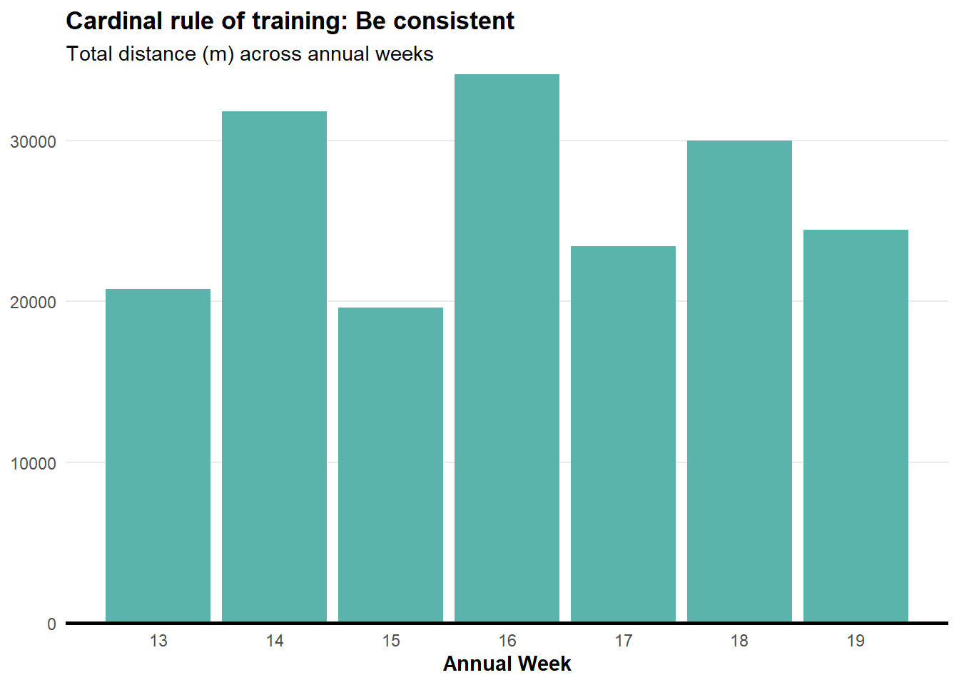
Energy consumption
I want to know energy consumption by activity type. To extract a clean name for this we need to do some string manipulation using the str_sub() function from the stringr package (part of the tidyverse).
df_workout %>%

   mutate(
      workoutActivityType = as.character(workoutActivityType),
      totalDistance = as.numeric(as.character(totalDistance)) * 1000,
      totalEnergyBurned = as.numeric(as.character(totalEnergyBurned)),
      endDate = as.Date(endDate),

      # Add week column
      week = isoweek(ymd(endDate)),

      # new column- text after 22nd character
      Type = str_sub(workoutActivityType, 22)) %>%

   # Filter out cycling
   filter(endDate >= "2020-03-23" & Type %in% c('Running','Other')) %>%
   group_by(week) %>%

ggplot(aes(x = week, y = totalEnergyBurned, fill = Type)) +
    geom_bar(stat = "identity", position = position_dodge()) +
    facet_wrap(~Type) +
    labs(title = "Weekly energy consumption (kj) by activity type",
        subtitle = "'Other' sessions include weights or walking",
        y = NULL,
        x = "Annual week") +
    scale_x_continuous(breaks = seq(13, 19, by = 1)) +
    scale_y_continuous(expand = c(0, 0)) +
    theme_minimal() +
    theme(legend.position = "none",
          panel.grid.minor = element_blank(),
          panel.grid.major.x = element_blank(),
          axis.line.x = element_line(colour = "black", size = 1),
          axis.title = element_text(face = "bold"),
          plot.title = element_text(face = "bold"),
          strip.text = element_text(face = "bold"))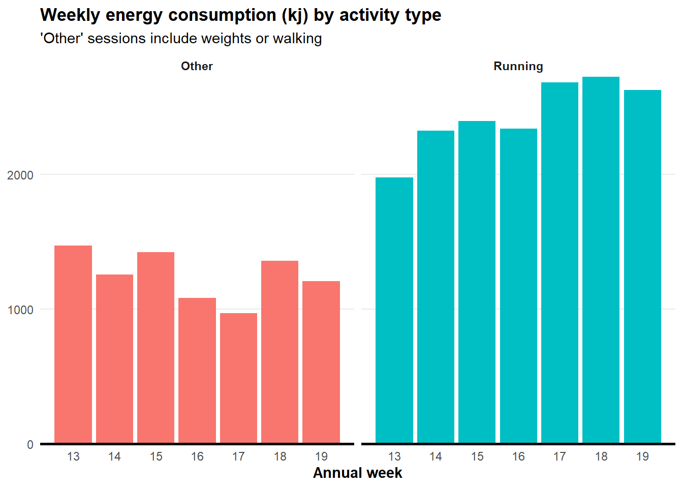
General activity data
Lets move on from workout data and import ‘Record’ data. This one will take a while to load.
df_record <-  XML:::xmlAttrsToDataFrame(xml["//Record"]) [c(1,6,8)]

# See data types available in record
  df_record %>%
    mutate(Type = str_sub(type, 25)) %>% # Include text after the 25th character
    select(Type) %>% distinct
Type
1 DietaryWater
2 Height
3 BodyMass
4 HeartRate
5 StepCount
6 DistanceWalkingRunning
7 BasalEnergyBurned
8 ActiveEnergyBurned
9 FlightsClimbed
10 RestingHeartRate
11 HeadphoneAudioExposure
12 SleepAnalysisIf you want to view the full dataset, you can use view(df_record).
Step data manipulation
This one isn’t exactly useful for athletes - this is more for my own interest of my activity (or lack of) during the COVID shut down.
I am replicating a plot created by Taras Kaduk on his blog post titled Analyze and visualize your iPhone’s Health app data in R.
df_record %>%

   mutate(
      # Rename type by removing that text
       Type = str_remove(type, "HKQuantityTypeIdentifier"),
       value = as.numeric(as.character(value)),
       Date = as.Date.character(startDate),
       weekday = wday(Date), # Day of week
       hour = hour(startDate)) %>% # Need to use the factor date
   filter(Type == 'StepCount' & Date >= "2020-03-23") %>%
   group_by(Date, weekday, hour) %>%  # Summarise by date, weekday and hour
   summarise(value = sum(value)) %>% # Sum steps over ^^
   group_by(weekday, hour) %>% # Now summarise by weekday and hour
   summarise(value = mean(value)) %>% # Take mean steps over ^^
   filter(between(hour,6,21)) %>% # Filtering to include between 6am - 9pm

ggplot(aes(x = hour, y = weekday,  fill = value)) +
  geom_tile(col = 'grey40') +
  scale_fill_continuous(labels = scales::comma,
                        low = 'grey95',
                        high = '#008FD5') +
  scale_x_continuous(
    breaks = c(6, 9, 12, 15, 18),
    label = c("6 AM", "9 AM", "Midday", "3PM", "6 PM")) +
  scale_y_reverse(
    breaks = c(1, 2, 3, 4, 5, 6, 7),
    label = c("Sunday",
              "Monday",
              "Tuesday",
              "Wednesday",
              "Thursday",
              "Friday",
              "Saturday")) +
  labs(
    title = "Not a lot of activity at the moment....",
    subtitle = "Step count heatmap by hour by day",
    y = NULL,
    x = NULL) +
  guides(fill = FALSE) +
  coord_equal() +
  theme_minimal() +
  theme(panel.grid.major = element_blank(),
        plot.title = element_text(face = "bold"))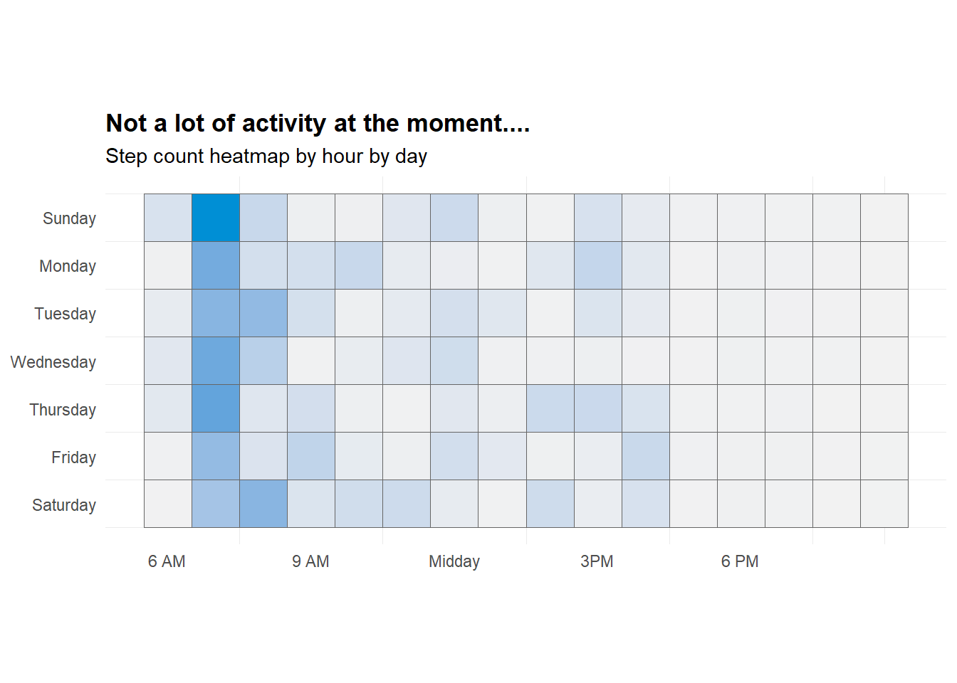
Heart rate data
One last one - we will plot HR across 2 days. I have added a colour scale for low (green) and high (red).
df_record %>%
  mutate(Type = str_remove(type, "HKQuantityTypeIdentifier"), # Rename
      value = as.numeric(as.character(value)),
      startDate = as_datetime(startDate),
      Date = as.Date.character(startDate)) %>%
      filter(Type == 'HeartRate') %>%
        filter(Date >= as.Date("2020-04-03") &  Date <= as.Date("2020-04-04")) %>%

ggplot(aes(x = startDate, y = value, colour = value)) +
  geom_line(size = 0.75) +
  scale_color_gradient(low = "springgreen3", high = "firebrick2") +
  labs(title = NULL,
       y = "Heart rate",
       x = NULL) +
  expand_limits(y = c(50, 200)) +
  theme_minimal() +
  theme(legend.position = "none",
        panel.grid.minor = element_blank(),
        panel.grid.major.x = element_blank(),
        axis.title = element_text(face = "bold"),
        plot.title = element_text(face = "bold"))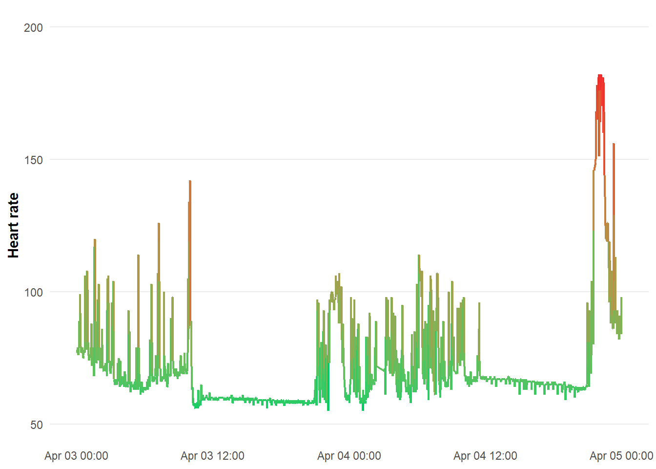
Access more Apple Health info
There are other data types available from Apple Health
df_record <-   XML:::xmlAttrsToDataFrame(xml["//Record"])
df_activity <- XML:::xmlAttrsToDataFrame(xml["//ActivitySummary"])
df_workout <-  XML:::xmlAttrsToDataFrame(xml["//Workout"])
df_clinical <- XML:::xmlAttrsToDataFrame(xml["//ClinicalRecord"])
df_location <- XML:::xmlAttrsToDataFrame(xml["//Location"])
For more information on analysing Apple Health data, check out:
Analyze and visualize your iPhone’s Health app data in R by Taras Kaduk
Explore your Apple Watch heart rate data in R by Jeff Johnston.
Thanks for looking! 😊
The presentation slides for this post can be viewed full screen or embedded below.
If you want to learn more about R, there is some awesome work out there from fellow Aussies!
📩 heidi.thornton@goldcoastfc.com.au
Thumbnail image from Apple.com
Full code
library("XML")
library("methods")
library("tidyverse")
library("lubridate")

xml <- xmlParse(paste("heidi-thornton_apple-data.xml"))
summary(xml)


df_workout <-  XML:::xmlAttrsToDataFrame(xml["//Workout"])[c(1:2, 4, 6, 12)]
head(df_workout, n = 5) # View the top 5 rows of data


# Daily running chart

df_workout %>%

    # Change data types (i.e. distance to m not km, numeric)
      mutate(
        workoutActivityType = as.character(workoutActivityType),
        totalDistance = as.numeric(as.character(totalDistance))*1000,
        duration = as.numeric(duration),
        endDate = as.Date(endDate)) %>%

    # Only running sessions- depending on watch the name may differ
      filter(workoutActivityType == "HKWorkoutActivityTypeRunning") %>%
      filter(endDate >= "2020-03-23") %>% # only after shut down

# Create ggplot
ggplot(aes(x= endDate, y = totalDistance)) +
    geom_bar(stat="identity", fill='#5ab4ac')+
    labs(title = "Not exactly periodised, but it's better than nothing....",
           subtitle = "Daily running volume (m)",
           x = "Date",
           y = NULL) +
    scale_x_date(date_breaks = "7 days",
                   date_labels = "%b %d") +
    scale_y_continuous(expand = c(0, 0)) +
    theme_minimal() +
    theme(panel.grid.minor = element_blank(),
        panel.grid.major.x = element_blank(),
        axis.line.x = element_line(colour = "black", size = 1),
        axis.title = element_text(face = "bold"),
        plot.title = element_text(face = "bold"))


# Weekly running chart

df_workout %>%

   mutate(
    workoutActivityType = as.character(workoutActivityType),
    totalDistance = as.numeric(as.character(totalDistance))*1000,
    endDate = as.Date(endDate),
    week = isoweek(ymd(endDate))) %>% # Add week column

   filter(workoutActivityType == "HKWorkoutActivityTypeRunning") %>%
   filter(endDate >= "2020-03-23") %>%
   group_by(week) %>% # summarise by week (starts week in 1st jan)

ggplot(aes(x = week, y = totalDistance)) +
  geom_bar(stat = "identity", fill='#5ab4ac') +
  labs(title = "Cardinal rule of training: Be consistent",
       subtitle = "Total distance (m) across annual weeks",
       x = "Annual Week",
       y = NULL) +
  scale_y_continuous(expand = c(0, 0)) +
  scale_x_continuous(breaks = seq(13, 19, 1)) +
  theme_minimal() +
  theme(panel.grid.minor = element_blank(),
        panel.grid.major.x = element_blank(),
        axis.line.x = element_line(colour = "black", size = 1),
        axis.title = element_text(face = "bold"),
        plot.title = element_text(face = "bold"))


# Energy consumption (Other vs Running) chart

df_workout %>%

   mutate(
      workoutActivityType = as.character(workoutActivityType),
      totalDistance = as.numeric(as.character(totalDistance)) * 1000,
      totalEnergyBurned = as.numeric(as.character(totalEnergyBurned)),
      endDate = as.Date(endDate),

      # Add week column
      week = isoweek(ymd(endDate)),

      # new column- text after 22nd character
      Type = str_sub(workoutActivityType, 22)) %>%

   # Filter out cycling
   filter(endDate >= "2020-03-23" & Type %in% c('Running','Other')) %>%
   group_by(week) %>%

ggplot(aes(x = week, y = totalEnergyBurned, fill = Type)) +
    geom_bar(stat = "identity", position = position_dodge()) +
    facet_wrap(~Type) +
    labs(title = "Weekly energy consumption (kj) by session type",
        subtitle = "'Other' sessions include weights or walking",
        y = NULL,
        x = "Annual week") +
    scale_x_continuous(breaks = seq(13, 19, by = 1)) +
    scale_y_continuous(expand = c(0, 0)) +
    theme_minimal() +
    theme(legend.position = "none",
          panel.grid.minor = element_blank(),
          panel.grid.major.x = element_blank(),
          axis.line.x = element_line(colour = "black", size = 1),
          axis.title = element_text(face = "bold"),
          plot.title = element_text(face = "bold"),
          strip.text = element_text(face = "bold"))


# Extract record data

df_record <-  XML:::xmlAttrsToDataFrame(xml["//Record"]) [c(1,6,8)]

# See data types available in record
  df_record %>%
    mutate(Type = str_sub(type, 25)) %>% # Include text after the 25th character
    select(Type) %>% distinct


# Step count chart

df_record %>%

   mutate(
      # Rename type by removing that text
       Type = str_remove(type, "HKQuantityTypeIdentifier"),
       value = as.numeric(as.character(value)),
       Date = as.Date.character(startDate),
       weekday = wday(Date), # Day of week
       hour = hour(startDate)) %>% # Need to use the factor date
   filter(Type == 'StepCount' & Date >= "2020-03-23") %>%
   group_by(Date, weekday, hour) %>%  # Summarise by date, weekday and hour
   summarise(value = sum(value)) %>% # Sum steps over ^^
   group_by(weekday, hour) %>% # Now summarise by weekday and hour
   summarise(value = mean(value)) %>% # Take mean steps over ^^
   filter(between(hour,6,21)) %>% # Filtering to include between 6am - 9pm

ggplot(aes(x = hour, y = weekday,  fill = value)) +
  geom_tile(col = 'grey40') +
  scale_fill_continuous(labels = scales::comma,
                        low = 'grey95',
                        high = '#008FD5') +
  scale_x_continuous(
    breaks = c(6, 9, 12, 15, 18),
    label = c("6 AM", "9 AM", "Midday", "3PM", "6 PM")) +
  scale_y_reverse(
    breaks = c(1, 2, 3, 4, 5, 6, 7),
    label = c("Sunday",
              "Monday",
              "Tuesday",
              "Wednesday",
              "Thursday",
              "Friday",
              "Saturday")) +
  labs(
    title = "Not a lot of activity at the moment....",
    subtitle = "Step count heatmap by hour by day",
    y = NULL,
    x = NULL) +
  guides(fill = FALSE) +
  coord_equal() +
  theme_minimal() +
  theme(panel.grid.major = element_blank(),
        plot.title = element_text(face = "bold"))


# Heart rate chart

df_record %>%
  mutate(Type = str_remove(type, "HKQuantityTypeIdentifier"), # Rename
      value = as.numeric(as.character(value)),
      startDate = as_datetime(startDate),
      Date = as.Date.character(startDate)) %>%
      filter(Type == 'HeartRate') %>%
        filter(Date >= as.Date("2020-04-03") &  Date <= as.Date("2020-04-04")) %>%

ggplot(aes(x = startDate, y = value, colour = value)) +
  geom_line(size = 0.75) +
  scale_color_gradient(low = "springgreen3", high = "firebrick2") +
  labs(title = NULL,
       y = "Heart rate",
       x = NULL) +
  expand_limits(y = c(50, 200)) +
  theme_minimal() +
  theme(legend.position = "none",
        panel.grid.minor = element_blank(),
        panel.grid.major.x = element_blank(),
        axis.title = element_text(face = "bold"),
        plot.title = element_text(face = "bold"))


# Other types of data from Apple Health

df_record <-   XML:::xmlAttrsToDataFrame(xml["//Record"])
df_activity <- XML:::xmlAttrsToDataFrame(xml["//ActivitySummary"])
df_workout <-  XML:::xmlAttrsToDataFrame(xml["//Workout"])
df_clinical <- XML:::xmlAttrsToDataFrame(xml["//ClinicalRecord"])
df_location <- XML:::xmlAttrsToDataFrame(xml["//Location"])