library(tidyverse)
library(lubridate)
library(ggtext)
library(here)An interesting metric available in the Catapult system is running imbalance.
Catapult’s Openfield software offers running symmetry metrics that try to quantify the load imbalance between the right and left leg when running. Detailed information about the running symmetry metrics and how to set them up is available in the Catapult Support documentation.
The documentation claims the practical applications of running symmetry metrics include:
- Rehabilitation - See changes over time as the athlete improves during the process of rehabilitation
- Return to Play - Use Running Symmetry as an objective return to play marker
- Athlete Screening - Use Running Symmetry on a weekly basis to identify changes in running mechanics
Running imbalance (%), arguably the most general running symmetry metric, is defined by Catapult as:
“Average percentage load difference between left and right legs, across all Running Symmetry Series/Efforts. A negative running imbalance % is indicative of an x% additional load on the left side (where x is the running imbalance value). A positive running imbalance % is indicative of an x% additional load on the right side (where x is the running imbalance value).”
Whilst I do have concerns about some of the measurement properties of this metric and don’t currently use it in practice for these reasons, I wanted to explore the data and see what it’s telling me. This post will show you how to export the data from Openfield Cloud, and visualise it using R and RStudio.
The full un-separated code is available at the end of this post for anyone looking to copy it into their script.
Step 1 | Export from Openfield Cloud
First thing to do is follow the steps outlined in the Catapult Support documentation to set up running symmetry metrics.
For a reason beyond my knowledge, when you perform a bulk export from Openfield Cloud with ‘All Parameters’ selected (when choosing a parameter group), you get an inconsistent number of columns in the .csv exports (if anyone knows why this might be, I’m interested to know!). This causes issues when we try to import and join the data into one data frame (i.e. table of data) in R.
To remedy this, we need to create a parameter group to lock the columns that we want in our exports (ensuring a consistent export format).
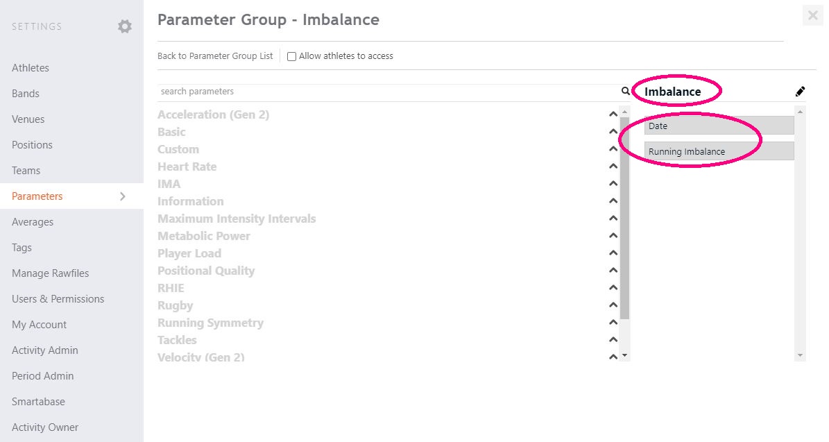
Create a parameter group
After logging into Openfield Cloud, press Settings
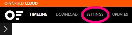
Select Parameters in the sidebar, then Parameter Groups in the top bar.
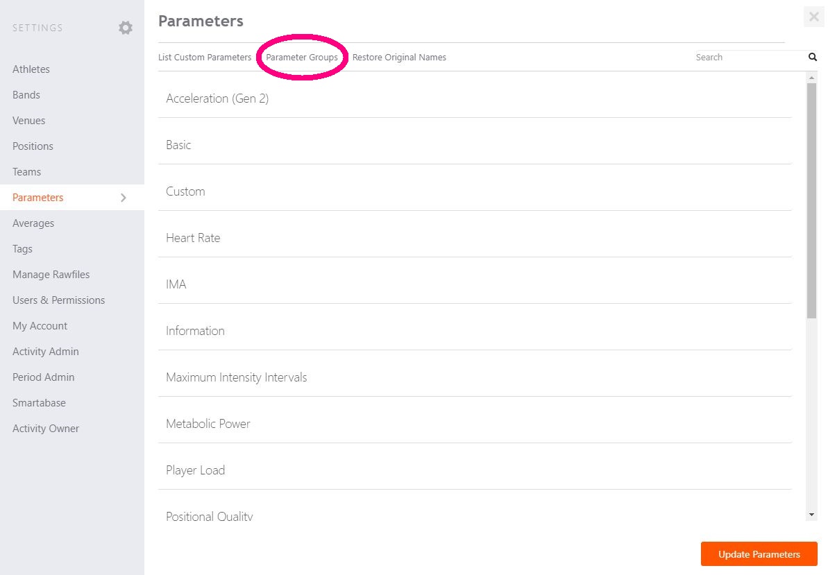
Now we need to Add new.
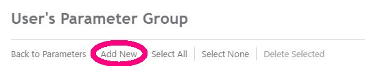
We can give the group we’re creating a name (I’m calling mine “Imbalance”) and select the metrics we’re interested in (I’m only selecting “Date” and “Running Imbalance”). Then we click the orange Add Parameter Group at the bottom of the window to save our new group.
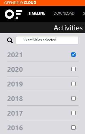
Select sessions to export
The Activities bar on the left of screen can be used to select multiple sessions that we’re interested in exporting data for. Using the click buttons on the right on the bar, we can select one or more years, months, days, or activities to export (I’ve selected all of 2021 below).
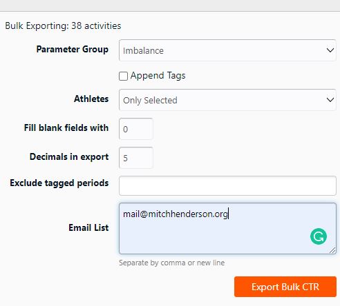
When more than one activity is selected, a green Bulk Export CTRs button will become available in the top right of screen (also showing how many activities have been selected). Click on it.

This will bring up a window allowing us to select some options for our exports. The only things we need to do is select our newly created parameter group (I’m selecting “Imbalance” below) and enter the email you’d like the links for the exports to go to. Then select Export Bulk CTR.
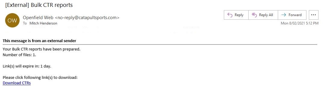
Download exports
You’ll then shortly receive one or more emails (depending on how many activities, and therefore data, you’re exporting) from Openfield Web with links to download .zip folders containing the exports.
Step 2 | Import into RStudio
Save all of your exports (keep them in .csv format) in a folder within your working directory (you can check your working directory in R or RStudio by running getwd() and you can change it with setwd(), but I’d recommend creating a project so it’s set for you). I’ve called my folder “Exports”.
Load packages
Open RStudio, and create a new R script (I recommend saving it with an appropriate name straight away).
Below are the packages we’ll need for this process. I’ve already installed them, so I’m only loading them here (and have commented out the installation commands at the top), but if you haven’t previously installed them then you’ll need to delete the hashtags at the beginning of the lines and run the top parts first (only needs to be done once). The install might take a while (minutes, not hours), and you might need to follow some prompts in the R console (bottom left window of RStudio) for the process to fully complete.
Note that I’m using a Windows computer (hence the device = "win" component of the code). I believe R works much better with fonts on Macs and this part of that line isn’t required (extrafont::loadfonts() should work, I’m interested to know if anyone reading is using a Mac).
Import files
Now, assuming you have a folder of your exports in your working directory (I have all mine in a folder called “Exports”), we can use a combination of the read_csv() and list.files() functions to:
- Import all files within your folder that include
.csvin their filename into RStudio at once - Skip the first 9 lines (which is metadata we don’t need)
- Join them all together and call this data frame “
data” - Filter away any period-level data so only activity-level rows remains (i.e. session totals)
We’ll also select() only the Date, Player Name, and Running Imbalance columns (all others are discarded), and use mutate() with dmy() to tell R that our Date variable should be in a date format.
data <-
  list.files(path = here("Exports"),
             pattern = "*.csv",
             full.names = T) %>%
  map_df(~read_csv(., skip = 9)) %>%
  filter(`Period Name` == "Session") %>%
  select(`Date`,
         `Player Name`,
         `Running Imbalance`) %>%
  mutate(Date = dmy(Date))
For everyone following along that uses the Catapult system and can access their team’s data, the code above is what’s required to import all your data into R. For those that just want to follow along with some dummy data in the same format, you can click here to download my example .csv file.
For privacy reasons, I’ll continue the tutorial using the dummy data contained in my .csv file. Note that all code from Step 3 onwards works on data imported either way (i.e. from either your own Openfield exports (method above) or my example .csv (method below)).
The import for the .csv file is much simpler:
data <- read_csv("example_running_imbalance_data.csv") %>%
  mutate(Date = dmy(Date))
The first 6 rows of data (251 rows, 3 columns in total) look like this:
| Date | Player Name | Running Imbalance |
|---|---|---|
| 2020-07-06 | Player Q | 0.94264 |
| 2020-07-06 | Player Q | -1.23166 |
| 2020-07-07 | Player Q | 0.87172 |
| 2020-07-10 | Player Q | -0.88351 |
| 2020-07-13 | Player Q | -0.90294 |
| 2020-07-13 | Player Q | -0.24748 |
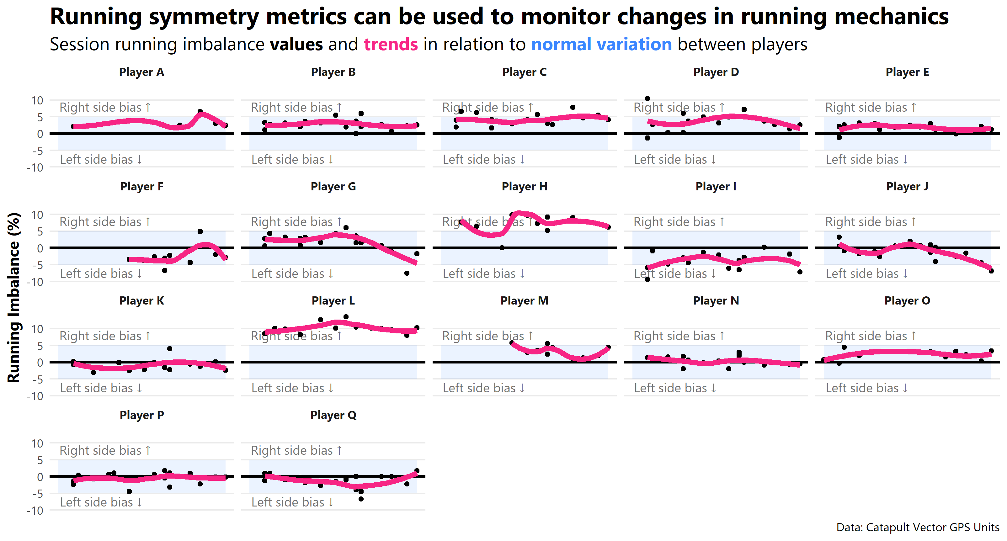
Step 3 | Visualise using {ggplot2}
It’s beyond the scope of this post to go into full details of what each part of this ggplot2 code is doing (I have done this for a previous post where I built a more sophisticated chart step-by-step for those interested).
In an attempt to avoid telling you all to just “draw the rest of the damn owl”, I’ll heavily comment my code so the purpose of all major functions are clear (context for the owl meme reference).

# Create an object called min_date representing the minimum value in my `Date` column
# Same thing for max_date with maximum value

min_date <- min(data$Date)
max_date <- max(data$Date)

# We're taking the object called `data` and creating a ggplot with `Date` on the x-axis and
# `Running Imbalance` on the y-axis

data %>%
  ggplot(aes(x = Date, y = `Running Imbalance`)) +

# Put a coloured rectangle that spans the width of the plot, and from -5% to 5% on the y-axis.

  annotate("rect",
           xmin = min_date, xmax = max_date, ymin = -5, ymax = 5,
           alpha = .1, fill = "#3A86FF") +

# Create a text string that says "Left / Right side bias" with an arrow in the specified location.
  annotate("text", x = min_date + 8.5, y = -7.5,
           label = paste0("Left side bias ", sprintf('\u2193')),
           size = 3.5, colour = "grey45", family = "Segoe UI") +

  annotate("text", x = min_date + 9.25, y = 8,
           label = paste0("Right side bias ", sprintf('\u2191')),
           size = 3.5, colour = "grey45", family = "Segoe UI") +

# Facet the chart so each player in the `Player Name` column will have their own chart

  facet_wrap(~`Player Name`) +

# Create a horizontal line through the middle of each chart

  geom_hline(yintercept = 0, size = 1) +

# Add dots that represent each data point

  geom_point() +

# Add a smoothed conditional mean line through the data points to aid the eye in seeing patterns.

  geom_smooth(se = F, size = 2, colour = "#F72585") +

# Remove x axis title; add chart title, subtitle, caption, and y-axis title
# Note the {ggtext} package allows us to use a little HTML to get coloured text!

  labs(x = NULL, y = "**Running Imbalance (%)**",
       title = "Running symmetry metrics can be used to monitor changes in running mechanics",
       subtitle = "Session running imbalance **values** and
       <span style = 'color:#F72585;'>**trends**</span>
       in relation to <span style = 'color:#3A86FF;'>**normal variation**</span>
     between players",
       caption = "Data: Catapult Vector GPS Units") +

# Give the chart a particular look using themes and theme options.
# I've removed unnecessary parts, changed the font, and made some parts bold.

  theme_minimal() +
  theme(text = element_text(family = "Segoe UI"),
        panel.grid.minor = element_blank(),
        panel.grid.major.x = element_blank(),
        axis.title.y = element_markdown(size = 12),
        strip.text = element_markdown(face = "bold"),
        axis.text.x = element_blank(),
        plot.title = element_markdown(face = "bold", size = 18),
        plot.subtitle = element_markdown(size = 14)) +

# Save the output in our working directory.

  ggsave("left_vs_right.png", width = 10.7, height = 5.75)
And that’s it! Let me know if you have any questions or want me to clarify anything. Very interested to hear your ideas about running symmetry / imbalance data and how it can be best visualised / presented.
If the interest is there, I can do a video walkthrough of this process (similar to my others on constructing a ggplot and tidying data).
Keep up to date with anything new from me on my Twitter.
Cheers,
Mitch
Thumbnail from Catapult
Full code
# Load packages -----------------------------------------------------------

library(tidyverse)
library(lubridate)
library(ggtext)
library(here)

# Import ------------------------------------------------------------------

# Full import method using your own exports from Openfield ↓

data <-
  list.files(path = here("Exports"),
             pattern = "*.csv",
             full.names = T) %>%
  map_df(~read_csv(., skip = 9)) %>%
  filter(`Period Name` == "Session") %>%
  select(`Date`,
         `Player Name`,
         `Running Imbalance`) %>%
  mutate(Date = dmy(Date))

# Import method using my `.csv` file that can be downloaded on my post ↓

data <- read_csv("example_running_imbalance_data.csv") %>%
  mutate(Date = dmy(Date))

# Visualise -------------------------------------------------------------------

min_date <- min(data$Date)
max_date <- max(data$Date)


data %>%
  ggplot(aes(x = Date, y = `Running Imbalance`)) +
  annotate("rect",
           xmin = min_date, xmax = max_date, ymin = -5, ymax = 5,
           alpha = .1, fill = "#3A86FF") +
  annotate("text", x = min_date + 8.5, y = -7.5,
           label = paste0("Left side bias ", sprintf('\u2193')),
           size = 3.5, colour = "grey45", family = "Segoe UI") +
  annotate("text", x = min_date + 9.25, y = 8,
           label = paste0("Right side bias ", sprintf('\u2191')),
           size = 3.5, colour = "grey45", family = "Segoe UI") +
  facet_wrap(~`Player Name`) +
  geom_hline(yintercept = 0, size = 1) +
  geom_point() +
  geom_smooth(se = F, size = 2, colour = "#F72585") +
  labs(x = NULL, y = "**Running Imbalance (%)**",
       title = "Running symmetry metrics can be used to monitor changes in running mechanics",
       subtitle = "Session running imbalance **values** and
       <span style = 'color:#F72585;'>**trends**</span>
       in relation to <span style = 'color:#3A86FF;'>**normal variation**</span>
     between players",
       caption = "Data: Catapult Vector GPS Units") +
  theme_minimal() +
  theme(text = element_text(family = "Segoe UI"),
        panel.grid.minor = element_blank(),
        panel.grid.major.x = element_blank(),
        axis.title.y = element_markdown(size = 12),
        strip.text = element_markdown(face = "bold"),
        axis.text.x = element_blank(),
        plot.title = element_markdown(face = "bold", size = 18),
        plot.subtitle = element_markdown(size = 14)) +
  ggsave("left_vs_right.png", width = 10.7, height = 5.75)