| player_name | percent_involvement | dob | arrival_at_team | reference_date |
|---|---|---|---|---|
| Andrej Kramaric | 0.0070175 | 19/06/1991 | 16/01/2015 | 15/05/2016 |
| Andy King | 0.3105263 | 29/10/1988 | 1/07/2007 | 15/05/2016 |
| Christian Fuchs | 0.7926901 | 7/04/1986 | 1/07/2015 | 15/05/2016 |
| Daniel Amartey | 0.0304094 | 21/12/1994 | 22/01/2016 | 15/05/2016 |
| Danny Drinkwater | 0.8868421 | 5/03/1990 | 20/01/2012 | 15/05/2016 |
| Danny Simpson | 0.7631579 | 4/01/1987 | 30/08/2014 | 15/05/2016 |
| Demarai Gray | 0.0546784 | 28/06/1996 | 4/01/2016 | 15/05/2016 |
| Gokhan Inler | 0.0567251 | 27/06/1984 | 19/08/2015 | 15/05/2016 |
| Jamie Vardy | 0.9160819 | 11/01/1987 | 1/07/2012 | 15/05/2016 |
| Jeffrey Schlupp | 0.4055556 | 23/12/1992 | 1/07/2010 | 15/05/2016 |
| Joe Dodoo | 0.0058480 | 29/06/1995 | 1/08/2013 | 15/05/2016 |
| Kasper Schmeichel | 1.0000000 | 5/11/1986 | 1/07/2011 | 15/05/2016 |
| Leonardo Ulloa | 0.2877193 | 26/07/1986 | 22/07/2014 | 15/05/2016 |
| Marc Albrighton | 0.8038012 | 18/11/1989 | 1/07/2014 | 15/05/2016 |
| Marcin Wasilewski | 0.0885965 | 9/06/1980 | 17/09/2013 | 15/05/2016 |
| Nathan Dyer | 0.0643275 | 29/11/1987 | 1/09/2015 | 15/05/2016 |
| N'Golo Kante | 0.8836257 | 29/03/1991 | 3/08/2015 | 15/05/2016 |
| Ritchie De Laet | 0.1921053 | 28/11/1988 | 1/07/2012 | 15/05/2016 |
| Riyad Mahrez | 0.8871345 | 21/02/1991 | 11/01/2014 | 15/05/2016 |
| Robert Huth | 0.9210526 | 18/08/1984 | 1/07/2015 | 15/05/2016 |
| Shinji Okazaki | 0.6005848 | 16/04/1986 | 1/07/2015 | 15/05/2016 |
| Wes Morgan | 1.0000000 | 21/01/1984 | 30/01/2012 | 15/05/2016 |
| Yohan Benalouane | 0.0198830 | 28/03/1987 | 3/08/2015 | 15/05/2016 |
“The ability to take data—to be able to understand it, to process it, to extract value from it, to visualize it, to communicate it—that’s going to be a hugely important skill in the next decades, … because now we really do have essentially free and ubiquitous data. So the complimentary scarce factor is the ability to understand that data and extract value from it.”
Great results and important messages from sports scientists and S&C coaches are too often lost at the final and most important hurdle of the scientific process: communication.
A clear, considered, and engaging visualisation helps by presenting the data in a way that’s digestible to people, not just machines.
On the 13th April 2020, I tweeted a thread of visualisations that I’d made recreating the work of Tom Worville of The Athletic.
Inspired by the work of @Worville showing @LFC’s age profile over the past few seasons, I tried to recreate his charts for some other competition-winning 🏆 teams over the last few years using #ggplot in #rstats. A thread.
1/6 pic.twitter.com/F9m4oVbLG0— Mitch Henderson (@mitchhendo_) April 13, 2020
This post will take you through the process of how I generated this one:
The full code will be posted at the end, as throughout the post I’ll be going through parts of it bit by bit.
If you’d prefer to watch me do it, this video shows me going through the whole process:
Step 1 | Data prep
Collate the data
The data that we will use needs to be in this format:
- The
percent_involvementcolumn is a 0 - 1 number representing the percentage of minutes played for the season. - The
dobcolumn is each players date of birth. - The
arrival_at_teamcolumn is the date the player joined the club. - The
reference_datecolumn is the date that you want to calculate age and time at the club from. In this circumstance, I’ve used the date of the last Premier League game of the 2015/16 season.
I found Leicester City’s data from 2015/16 at transfermarkt.com.
Save this file as a .csv in your working directory.
Find a logo
Find your team’s logo online (preferably high resolution .png image with a transparent background), and save it into your working directory. I found this one on Leicester City’s Wikipedia page.
![]()
Step 2 | Load packages and import data
R packages
The below packages need to be loaded at the beginning of your R script. If this is the first time using any of these packages on your computer, make sure you install them first (e.g. install.packages("package_name")).
Using different fonts in R can be tricky, particularly on Windows machines (like I use). If you want to use a non-standard font like I have and you’re unfamiliar with the setup, read this article by June Choe that walks you through it.
Later in this post I’ll be using a font called “URWGeometricW03-Light” that I had to download online, you’ll need to substitute this in the code to a font available to you for the code to work (or aquire this font).
library(tidyverse)
library(lubridate)
library(ggrepel)
library(ggforce)
library(magick)
library(scales)
Add metadata
This is where we define what will end up being used for our title, subtitle, caption, and logo.
# Metadata ---------------------------------------------------------------

# Title, subtitle, and legend
team_name <- "Leicester City"
short_name <- "Foxes"
league <- "English Premier League"
season <- "2015/16"

# Caption
data_source <- "transfermarkt.com"
social_media_handle <- "@mitchhendo_"

# Name of logo file within working directory
logo_file_name <- "leicester_logo.png"
Load data
This section will read in the data from my file called leicester_data.csv in my working directory, and make it an object called data. Then we tell R what kind of data certain columns are (number, date, character etc), and calculate a few new columns based on the data within the file.
I’ve added comments to the code so it’s easier to understand what each part is doing. Anything after a # is a comment which isn’t executed as code. Comments are used for explaining your code to others or yourself in the future.
# Data import -------------------------------------------------------------

data <- read_csv('data_leicester.csv') %>% # Read in this file
  mutate(
    dob = dmy(dob),
    # Recognise this column as a date

    reference_date = dmy(reference_date),
    # Recognise this column as a date

    arrival_at_team = dmy(arrival_at_team),
    # Recognise this column as a date

    age = (reference_date - dob) / 365,
    # Create a new column that calculates each players age at the reference date

    age_at_arrival = (arrival_at_team - dob) / 365,
    # Create a new column that calculates each players age at arrival to the club

    time_with_team = as_factor(ifelse(arrival_at_team < reference_date - 365, "Years > 1", "Years < 1"))
    # Create a new column that determines whether a player has been at the club for longer than a year or not
  )
Step 3 | Create plot
Prep
Before we create the ggplot object, we need to define a few things to make the plotting easier.
Firstly, we define what colours we want for the dots and call this object year_colours (using hex code to specify colours), and also define a series of numbers that we’ll call index which will allow us to plot the trailing lines behind the players (showing how long they’ve been at the club for).
# Colours of the dots
year_colours <- c(`Years > 1` = "#25ABF8", `Years < 1` = "#CE3A6C")

# This vector is needed to draw the trailing lines showing how long a player has been at the club
# Don't change this unless you know what you're doing
index <- c(0, 0.25, 0.5, 0.75, 1)
Plotting
Now the fun begins. Let’s start building the plot.
We’ll start by using the ggplot function and telling it that the data we’re using is from the data object we created earlier. The aes() function is used to specify what parts of our data are going to be used in the plot, so we say the x-axis will be our age column and the y-axis will be our percent_involvement column.
ggplot(data = data, aes(x = age, y = percent_involvement))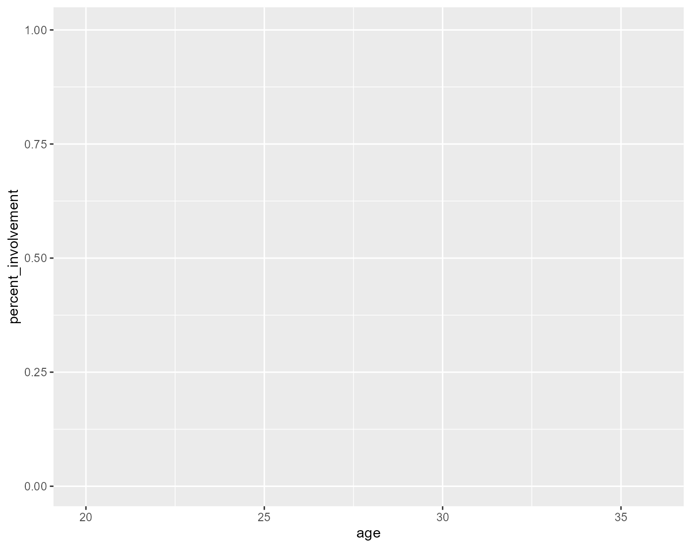
This is essentially the canvas that we’ll build from.
Next we’ll add our dots using the geom_point() function. The way the ggplot function works is by adding layers (called geoms) to the “canvas”. We add layers or aspects to the plot by adding them with a +.
Note I’ve added another column from our dataset to specify the colour in the aes() function for the geom_point() layer only. The data specified in the aes() function at the top is applied to all geoms below unless specified otherwise within the an individual geom. I’ve also manually adjusted the size of the dots, which is done outside the aes().
ggplot(data = data, aes(x = age, y = percent_involvement)) +
  geom_point(aes(colour = time_with_team), size = 4)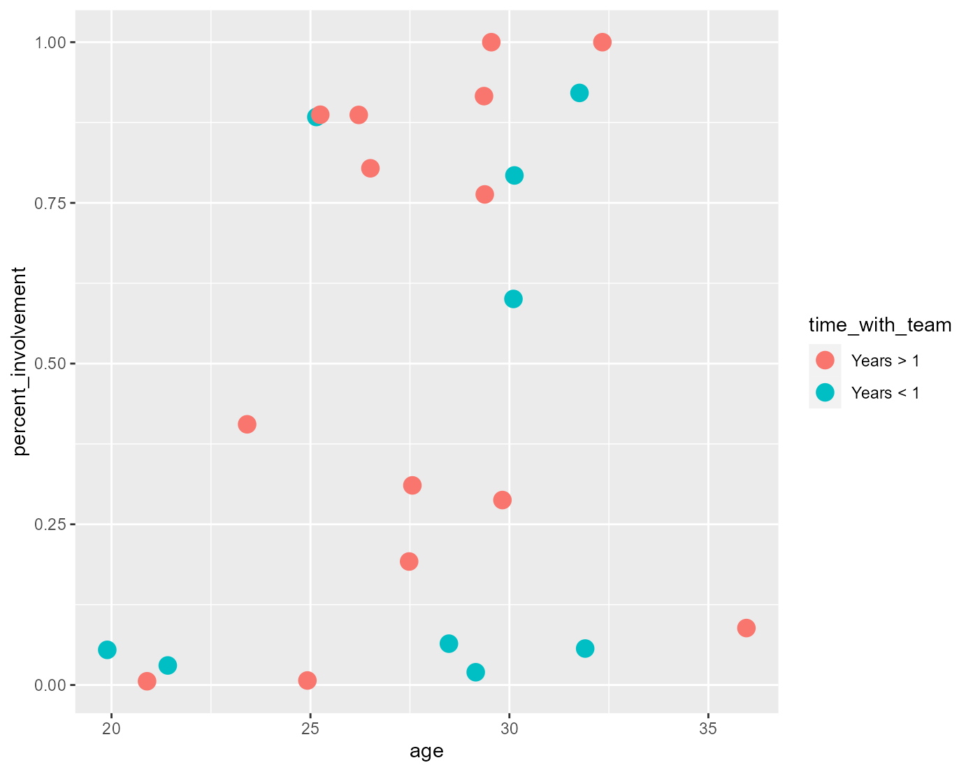
Next we’ll add our title, subtitle, x-axis title, caption, and legend title using the labs() function. All of the information for these has been defined in Step 2 where we added the metadata.
The paste0() function essentially allows us to paste together objects we’ve defined using code and written character strings to create a character string that dynamically changes based on different inputs (e.g. paste0(team_name, " | Squad Age Profile") becomes “Leicester City | Squad Age Profile”). You can use the dynamic titles like I have, or you could simply write what you want each part to say within quotation marks like I did for the x-axis title.
ggplot(data = data, aes(x = age, y = percent_involvement)) +
  geom_point(aes(colour = time_with_team), size = 4) +
  labs(x = "Age",
       title = paste0(team_name, " | Squad Age Profile"),
       subtitle = paste0(league, " | Season ", season),
       caption = paste0(social_media_handle, " | Data: ", data_source),
       colour = paste0("Time at ", short_name))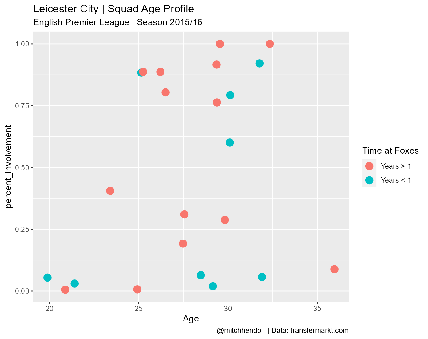
Next we’ll fix up our y-axis by using the scale_y_continuous() function to give it a proper title, use percent scales, and tell it where to break up the axis ticks.
ggplot(data = data, aes(x = age, y = percent_involvement)) +
  geom_point(aes(colour = time_with_team), size = 4) +
  labs(x = "Age",
       title = paste0(team_name, " | Squad Age Profile"),
       subtitle = paste0(league, " | Season ", season),
       caption = paste0(social_media_handle, " | Data: ", data_source),
       colour = paste0("Time at ", short_name)) +
  scale_y_continuous("Share of minutes played",
                     labels = scales::percent_format(accuracy = 1),
                     breaks = c(0, 0.2, 0.4, 0.6, 0.8, 1))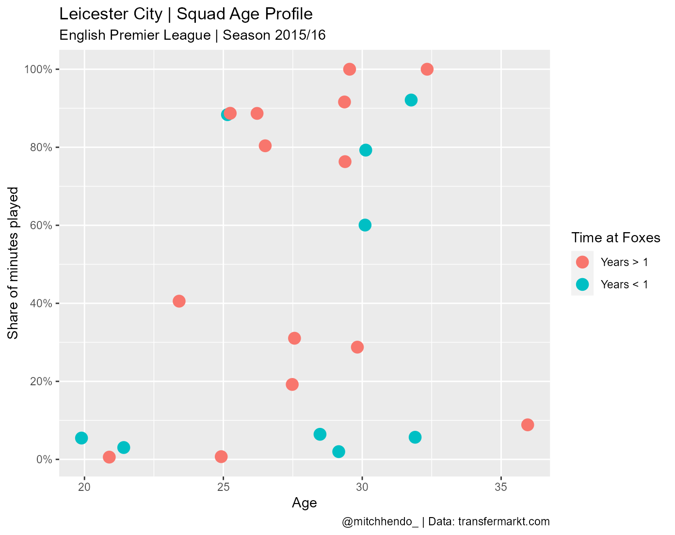
Then we set our axis limits using the expand_limits(), and x-axis breaks using scale_x_continuous().
ggplot(data = data, aes(x = age, y = percent_involvement)) +
  geom_point(aes(colour = time_with_team), size = 4) +
  labs(x = "Age",
       title = paste0(team_name, " | Squad Age Profile"),
       subtitle = paste0(league, " | Season ", season),
       caption = paste0(social_media_handle, " | Data: ", data_source),
       colour = paste0("Time at ", short_name)) +
  scale_y_continuous("Share of minutes played",
                     labels = scales::percent_format(accuracy = 1),
                     breaks = c(0, 0.2, 0.4, 0.6, 0.8, 1)) +
  expand_limits(x = c(16, 40), y = c(0, 1)) +
  scale_x_continuous(breaks = seq(16, 40, 4))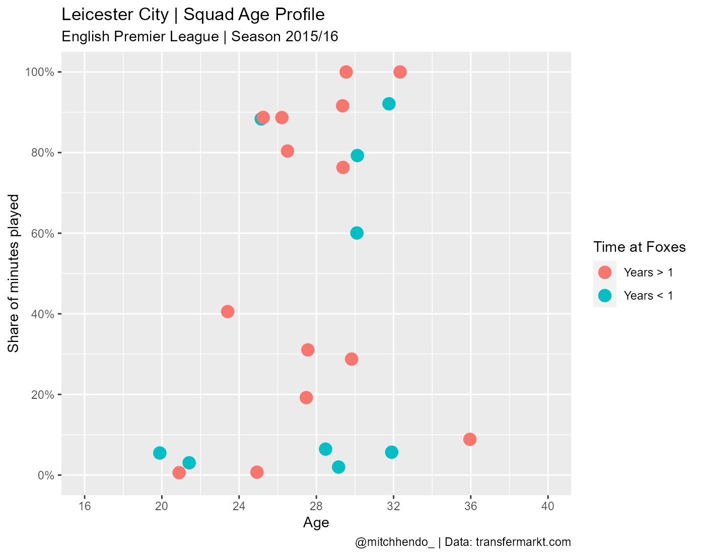
We can add our colours to the dots that we specified earlier by using scale_colour_manual() and specifying the values to be our object year_colours.
ggplot(data = data, aes(x = age, y = percent_involvement)) +
  geom_point(aes(colour = time_with_team), size = 4) +
  labs(x = "Age",
       title = paste0(team_name, " | Squad Age Profile"),
       subtitle = paste0(league, " | Season ", season),
       caption = paste0(social_media_handle, " | Data: ", data_source),
       colour = paste0("Time at ", short_name)) +
  scale_y_continuous("Share of minutes played",
                     labels = scales::percent_format(accuracy = 1),
                     breaks = c(0, 0.2, 0.4, 0.6, 0.8, 1)) +
  expand_limits(x = c(16, 40), y = c(0, 1)) +
  scale_colour_manual(values = year_colours)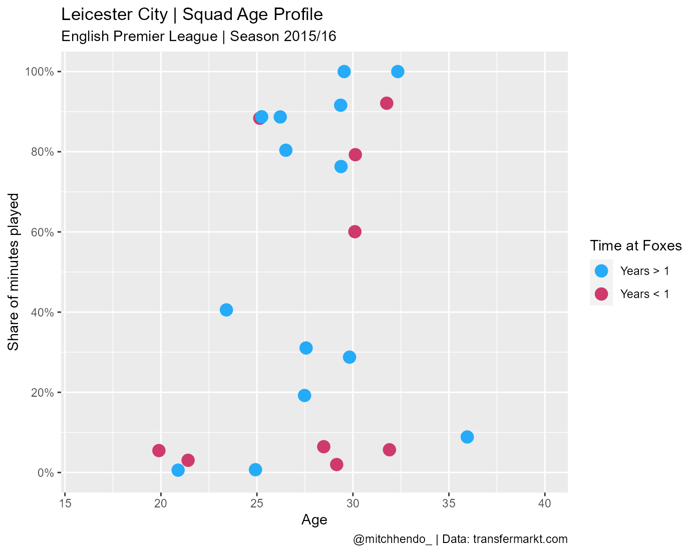
One of the most fun parts of using ggplot in my mind is playing around with the theme. There are a number of basic themes built into ggplot aswell as some more fun ones that can be added with packages like hrbrthemes, ggtech (which has themes to imitate AirBnb, Facebook, Google and Twitter’s style), and ggthemes (which has themes to imitate plots made by FiveThirtyEight, Wall Street Journal, and The Economist among others). The best page I’ve found for exploring different themes and theme packages is Themes to improve your ggplot figures by rfortherestofus.com. You can also modify themes any way you’d like using the theme() function which we’ll get to next.
I’ll use theme_minimal() as a base.
ggplot(data = data, aes(x = age, y = percent_involvement)) +
  geom_point(aes(colour = time_with_team), size = 4) +
  labs(x = "Age",
       title = paste0(team_name, " | Squad Age Profile"),
       subtitle = paste0(league, " | Season ", season),
       caption = paste0(social_media_handle, " | Data: ", data_source),
       colour = paste0("Time at ", short_name)) +
  scale_y_continuous("Share of minutes played",
                     labels = scales::percent_format(accuracy = 1),
                     breaks = c(0, 0.2, 0.4, 0.6, 0.8, 1)) +
  expand_limits(x = c(16, 40), y = c(0, 1)) +
  scale_colour_manual(values = year_colours) +
  theme_minimal()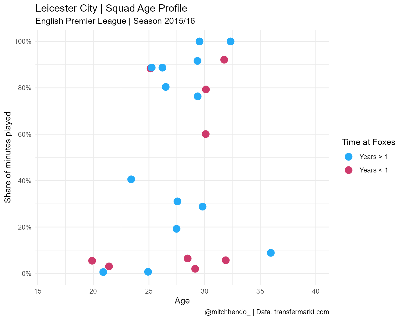
You can adjust any aspect of the theme manually with theme(). The flexibility and power of this is almost endless, and far beyond the scope of this post, but carefully look through all the arguments I’ve written and you’ll be able to understand a lot of it.
Remember that you will likely need to change the font (the family argument within theme()) where mine says URWGeometricW03-Light to a font available to you (fonts can be tricky, this post will help).
Feel free to play around with these to get a different look or to get a better understanding of what they’re doing. For example, you could change the colour of the plot area (i.e. where the data goes) by changing the hex code in plot.background = element_rect(fill = "#141622").
ggplot(data = data, aes(x = age, y = percent_involvement)) +
  geom_point(aes(colour = time_with_team), size = 4) +
  labs(x = "Age",
       title = paste0(team_name, " | Squad Age Profile"),
       subtitle = paste0(league, " | Season ", season),
       caption = paste0(social_media_handle, " | Data: ", data_source),
       colour = paste0("Time at ", short_name)) +
  scale_y_continuous("Share of minutes played",
                     labels = scales::percent_format(accuracy = 1),
                     breaks = c(0, 0.2, 0.4, 0.6, 0.8, 1)) +
  expand_limits(x = c(16, 40), y = c(0, 1)) +
  scale_colour_manual(values = year_colours) +
  theme_minimal() +
  theme(legend.position = "right",
        panel.grid.minor = element_blank(),
        plot.background = element_rect(fill = "#141622"),
        panel.background = element_rect(fill = "#141622",
                                        colour = "#141622",
                                        size = 2,
                                        linetype = "solid"),
        panel.grid.major = element_line(size = 0.5,
                                        linetype = 'solid',
                                        colour = "gray30"),
        axis.title.x = element_text(size = 13,
                                    face = "bold",
                                    colour = "white",
                                    family = "Century Gothic"),
        axis.title.y = element_text(size = 13,
                                    face = "bold",
                                    colour = "white",
                                    family = "Century Gothic"),
        axis.text.x = element_text(colour = "white"),
        axis.text.y = element_text(colour = "white"),
        plot.title = element_text(face = "bold",
                                  colour = "white",
                                  size = 14,
                                  family = "Century Gothic"),
        plot.subtitle = element_text(colour = "white",
                                     family = "URWGeometricW03-Light",
                                     size = 10),
        plot.caption = element_text(colour = "white",
                                    family = "URWGeometricW03-Light",
                                    size = 10),
        plot.caption.position = "plot",
        legend.title = element_text(colour = "white",
                                    family = "URWGeometricW03-Light",
                                    size = 14),
        legend.text = element_text(colour = "white",
                                   family = "URWGeometricW03-Light",
                                   size = 14))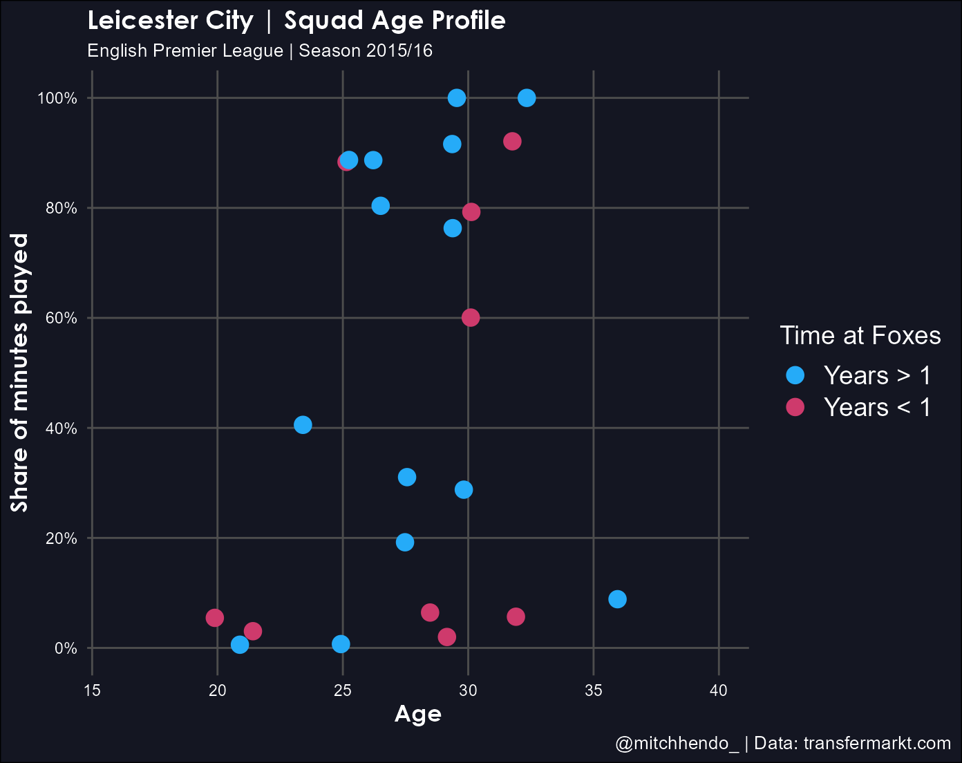
Next we add the player name labels to the plot using geom_text_repel() from the ggrepel package we loaded earlier. It’s a handy function that basically ensures labels don’t overlap each other.
The order in which we add things from here starts to matter now. Like I mentioned earlier, becuase ggplot’s are built with layers, you need to think about what order you want them laid. I want the labels to be added on top of the dots, so I’ll put this geom right after geom_point().
Again, in my code below, this geom uses the “URWGeometricW03-Light” font I got online. You’ll need to download this font or change it to a font available to you.
ggplot(data = data, aes(x = age, y = percent_involvement)) +
  geom_point(aes(colour = time_with_team), size = 4) +
  geom_text_repel(aes(label = player_name),
                  size = 3.25,
                  colour = "white",
                  family = "URWGeometricW03-Light") +
  labs(x = "Age",
       title = paste0(team_name, " | Squad Age Profile"),
       subtitle = paste0(league, " | Season ", season),
       caption = paste0(social_media_handle, " | Data: ", data_source),
       colour = paste0("Time at ", short_name)) +
  scale_y_continuous("Share of minutes played",
                     labels = scales::percent_format(accuracy = 1),
                     breaks = c(0, 0.2, 0.4, 0.6, 0.8, 1)) +
  expand_limits(x = c(16, 40), y = c(0, 1)) +
  scale_colour_manual(values = year_colours) +
  theme_minimal() +
  theme(legend.position = "right",
        panel.grid.minor = element_blank(),
        plot.background = element_rect(fill = "#141622"),
        panel.background = element_rect(fill = "#141622",
                                        colour = "#141622",
                                        size = 2,
                                        linetype = "solid"),
        panel.grid.major = element_line(size = 0.5,
                                        linetype = 'solid',
                                        colour = "gray30"),
        axis.title.x = element_text(size = 13,
                                    face = "bold",
                                    colour = "white",
                                    family = "Century Gothic"),
        axis.title.y = element_text(size = 13,
                                    face = "bold",
                                    colour = "white",
                                    family = "Century Gothic"),
        axis.text.x = element_text(colour = "white"),
        axis.text.y = element_text(colour = "white"),
        plot.title = element_text(face = "bold",
                                  colour = "white",
                                  size = 14,
                                  family = "Century Gothic"),
        plot.subtitle = element_text(colour = "white",
                                     family = "URWGeometricW03-Light",
                                     size = 10),
        plot.caption = element_text(colour = "white",
                                    family = "URWGeometricW03-Light",
                                    size = 10),
        plot.caption.position = "plot",
        legend.title = element_text(colour = "white",
                                    family = "URWGeometricW03-Light",
                                    size = 14),
        legend.text = element_text(colour = "white",
                                   family = "URWGeometricW03-Light",
                                   size = 14))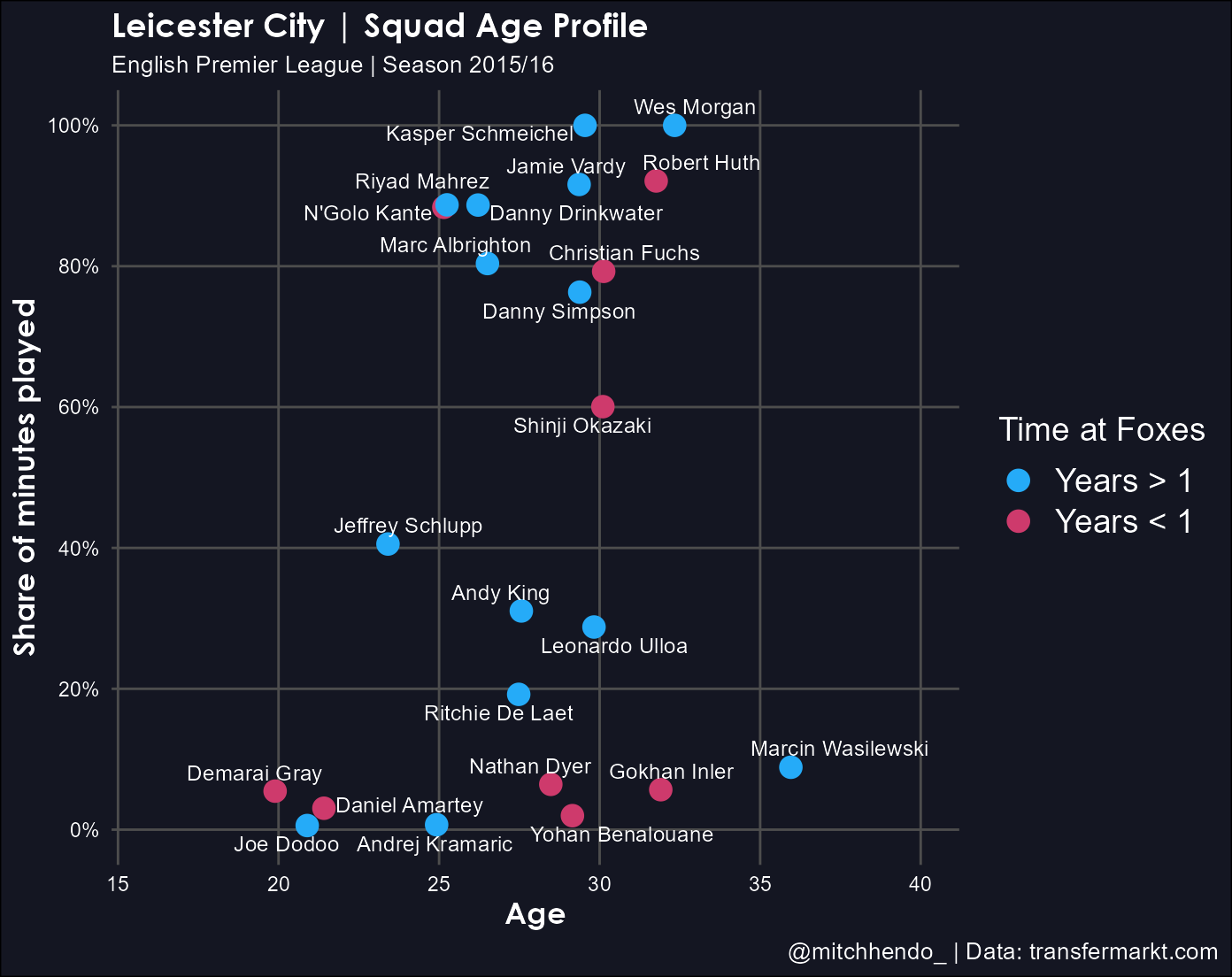
The plot is really starting to look like the finished product now.
We need to add the trailing white lines with the geom_link() function from the ggforce package we’ve loaded. Again, the order is important here, we want the lines to be beneath the dots so we add this geom before geom_point().
ggplot(data = data, aes(x = age, y = percent_involvement)) +
  geom_link(aes(x = age_at_arrival,
                xend = age,
                yend = percent_involvement,
                alpha = stat(index)),
            colour = "white",
            lineend = "round",
            show.legend = F) +
  geom_point(aes(colour = time_with_team), size = 4) +
  geom_text_repel(aes(label = player_name),
                  size = 3.25,
                  colour = "white",
                  family = "URWGeometricW03-Light") +
  labs(x = "Age",
       title = paste0(team_name, " | Squad Age Profile"),
       subtitle = paste0(league, " | Season ", season),
       caption = paste0(social_media_handle, " | Data: ", data_source),
       colour = paste0("Time at ", short_name)) +
  scale_y_continuous("Share of minutes played",
                     labels = scales::percent_format(accuracy = 1),
                     breaks = c(0, 0.2, 0.4, 0.6, 0.8, 1)) +
  expand_limits(x = c(16, 40), y = c(0, 1)) +
  scale_colour_manual(values = year_colours) +
  theme_minimal() +
  theme(legend.position = "right",
        panel.grid.minor = element_blank(),
        plot.background = element_rect(fill = "#141622"),
        panel.background = element_rect(fill = "#141622",
                                        colour = "#141622",
                                        size = 2,
                                        linetype = "solid"),
        panel.grid.major = element_line(size = 0.5,
                                        linetype = 'solid',
                                        colour = "gray30"),
        axis.title.x = element_text(size = 13,
                                    face = "bold",
                                    colour = "white",
                                    family = "Century Gothic"),
        axis.title.y = element_text(size = 13,
                                    face = "bold",
                                    colour = "white",
                                    family = "Century Gothic"),
        axis.text.x = element_text(colour = "white"),
        axis.text.y = element_text(colour = "white"),
        plot.title = element_text(face = "bold",
                                  colour = "white",
                                  size = 14,
                                  family = "Century Gothic"),
        plot.subtitle = element_text(colour = "white",
                                     family = "URWGeometricW03-Light",
                                     size = 10),
        plot.caption = element_text(colour = "white",
                                    family = "URWGeometricW03-Light",
                                    size = 10),
        plot.caption.position = "plot",
        legend.title = element_text(colour = "white",
                                    family = "URWGeometricW03-Light",
                                    size = 14),
        legend.text = element_text(colour = "white",
                                   family = "URWGeometricW03-Light",
                                   size = 14))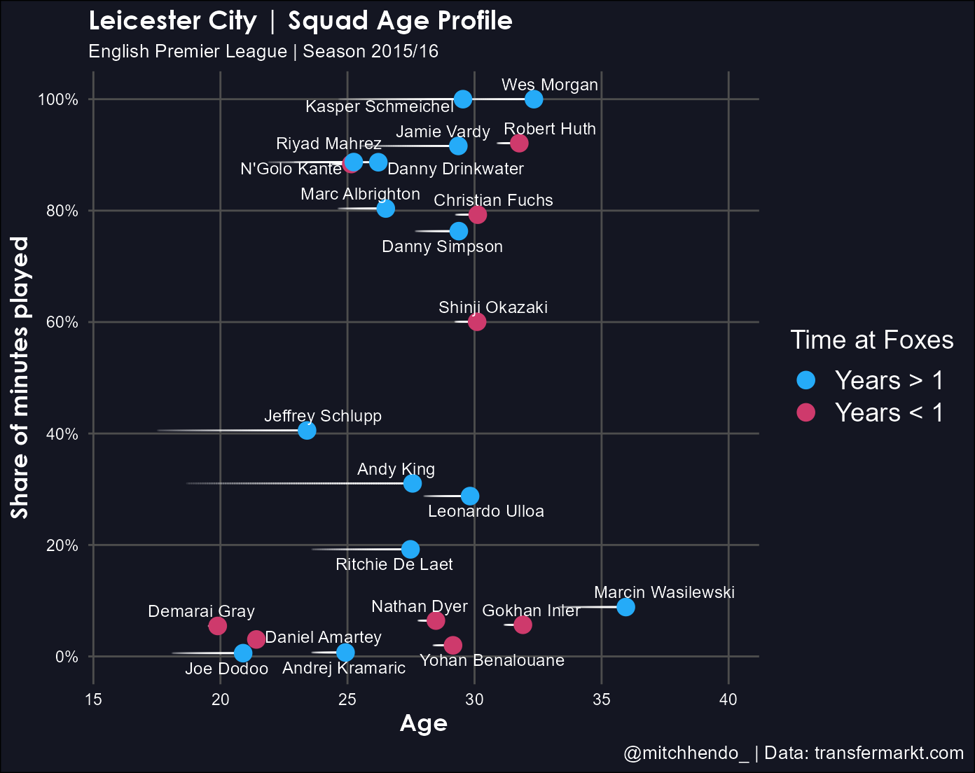
Now we need to add the green Peak Years area and label. This is done with annotate() which manually adds things like shapes, text, or images. We’re adding a shape (rect for rectangle) and text, so we add 2 annotate() geoms before anything else (because we want them to be at the deepest layer), and provide it the coordinates so it knows where to put them.
Once again, change family if you don’t have the “URWGeometricW03-Light” font.
ggplot(data = data, aes(x = age, y = percent_involvement)) +
  annotate("rect",
           xmin = 24,
           xmax = 29,
           ymin = -Inf,
           ymax = 1,
           alpha = 0.5,
           fill = "mediumseagreen") +
  annotate("text",
           x = 26.5,
           y = 1.05,
           label = "Peak Years",
           colour = "mediumseagreen",
           alpha = 0.7,
           family = "URWGeometricW03-Light",
           size = 5) +
  geom_link(aes(x = age_at_arrival,
                xend = age,
                yend = percent_involvement,
                alpha = stat(index)),
            colour = "white",
            lineend = "round",
            show.legend = F) +
  geom_point(aes(colour = time_with_team), size = 4) +
  geom_text_repel(aes(label = player_name),
                  size = 3.25,
                  colour = "white",
                  family = "URWGeometricW03-Light") +
  labs(x = "Age",
       title = paste0(team_name, " | Squad Age Profile"),
       subtitle = paste0(league, " | Season ", season),
       caption = paste0(social_media_handle, " | Data: ", data_source),
       colour = paste0("Time at ", short_name)) +
  scale_y_continuous("Share of minutes played",
                     labels = scales::percent_format(accuracy = 1),
                     breaks = c(0, 0.2, 0.4, 0.6, 0.8, 1)) +
  expand_limits(x = c(16, 40), y = c(0, 1)) +
  scale_colour_manual(values = year_colours) +
  theme_minimal() +
  theme(legend.position = "right",
        panel.grid.minor = element_blank(),
        plot.background = element_rect(fill = "#141622"),
        panel.background = element_rect(fill = "#141622",
                                        colour = "#141622",
                                        size = 2,
                                        linetype = "solid"),
        panel.grid.major = element_line(size = 0.5,
                                        linetype = 'solid',
                                        colour = "gray30"),
        axis.title.x = element_text(size = 13,
                                    face = "bold",
                                    colour = "white",
                                    family = "Century Gothic"),
        axis.title.y = element_text(size = 13,
                                    face = "bold",
                                    colour = "white",
                                    family = "Century Gothic"),
        axis.text.x = element_text(colour = "white"),
        axis.text.y = element_text(colour = "white"),
        plot.title = element_text(face = "bold",
                                  colour = "white",
                                  size = 14,
                                  family = "Century Gothic"),
        plot.subtitle = element_text(colour = "white",
                                     family = "URWGeometricW03-Light",
                                     size = 10),
        plot.caption = element_text(colour = "white",
                                    family = "URWGeometricW03-Light",
                                    size = 10),
        plot.caption.position = "plot",
        legend.title = element_text(colour = "white",
                                    family = "URWGeometricW03-Light",
                                    size = 14),
        legend.text = element_text(colour = "white",
                                   family = "URWGeometricW03-Light",
                                   size = 14))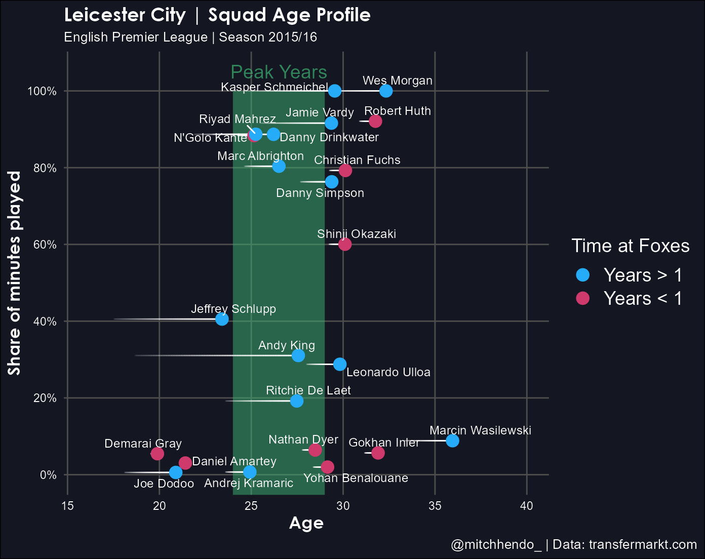
Step 4 | Saving and adding the logo
Saving the plot
To save the plot as a high resolution image we can use the ggsave() function. Here I save the file with a dynamic name that equates to the current date, underscore, short_name (object we created in Step 2 = “Foxes”), underscore, peak-years.png. So for me, today as I write this post, the file would be saved as 2020-04-24_Foxes_peak-years.png, but that would be different if I was to save it on a different day or with a different short_name object.
The dpi argument is dots per inch and allows you to set the resolution. Higher is better but also means a larger file size (dpi = 600 is good).
The file will be saved into your working directory.
ggsave(paste0(Sys.Date(), "_", short_name, "_peak-years.png"),
       height = 5.75,
       width = 7.25,
       dpi = 600)
Adding the logo
There’s a number of ways to add a logo to a ggplot object, but they can be quite complex. The best one I’ve found is using a custom function that Thomas Mock created and posted on his blog.
It reads in the plot as a .png image, the logo as another .png image, and puts the logo in a corner you specify at a size you specify.
The only parts of this you may want to modify are the sections below ### ONLY MODIFY FROM HERE DOWN. You can choose which corner you want the logo in, what is the file name you saved the plot image, and the size of the logo (bigger number = smaller logo).
# Add logo function -------------------------------------------------------
add_logo <- function(plot_path, logo_path, logo_position, logo_scale = 10){
# Requires magick R Package https://github.com/ropensci/magick
# Useful error message for logo position
if (!logo_position %in% c("top right", "top left", "bottom right", "bottom left")) {
stop("Error Message: Uh oh! Logo Position not recognized\n Try: logo_positon = 'top left', 'top right', 'bottom left', or 'bottom right'")
}
# read in raw images
plot <- magick::image_read(plot_path)
logo_raw <- magick::image_read(logo_path)
# get dimensions of plot for scaling
plot_height <- magick::image_info(plot)$height
plot_width <- magick::image_info(plot)$width
# default scale to 1/10th width of plot
# Can change with logo_scale
logo <- magick::image_scale(logo_raw, as.character(plot_width/logo_scale))
# Get width of logo
logo_width <- magick::image_info(logo)$width
logo_height <- magick::image_info(logo)$height
# Set position of logo
# Position starts at 0,0 at top left
# Using 0.01 for 1% - aesthetic padding
if (logo_position == "top right") {
x_pos = plot_width - logo_width - 0.02 * plot_width
y_pos = 0.01 * plot_height
} else if (logo_position == "top left") {
x_pos = 0.01 * plot_width
y_pos = 0.01 * plot_height
} else if (logo_position == "bottom right") {
x_pos = plot_width - logo_width - 0.02 * plot_width
y_pos = plot_height - logo_height - 0.02 * plot_height
} else if (logo_position == "bottom left") {
x_pos = 0.01 * plot_width
y_pos = plot_height - logo_height - 0.02 * plot_height
}
# Compose the actual overlay
magick::image_composite(plot, logo, offset = paste0("+", x_pos, "+", y_pos))
}
### ONLY MODIFY FROM HERE DOWN
# Choose logo, position, and size (bigger number = smaller logo) ----------
plot_with_logo <- add_logo(
plot_path = paste0(Sys.Date(), "_", short_name, "_peak-years.png"), # url or local file for the plot
logo_path = logo_file_name, # url or local file for the logo
logo_position = "top right", # choose a corner
# 'top left', 'top right', 'bottom left' or 'bottom right'
logo_scale = 7
)
# save the image and write to working directory
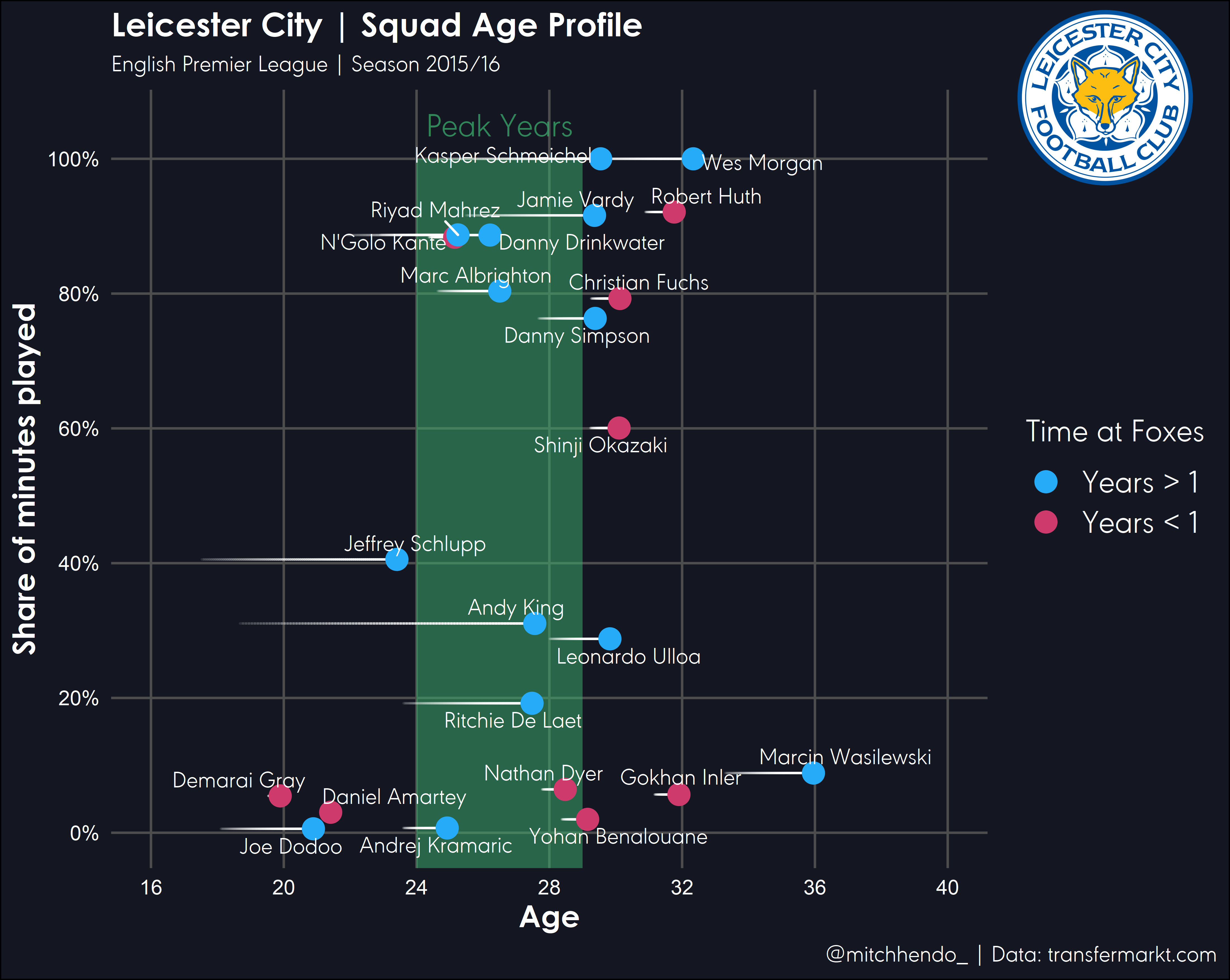
magick::image_write(plot_with_logo, paste0(Sys.Date(), "_", short_name, "_peak-years.png"))This’ll save over the file we created with a new file that’s the plot image with the logo added like this:
And that’s it! Let me know if you have any questions or want me to clarify anything.
Keep up to date with anything new from me on my Twitter.
Cheers,
Mitch
Full code
library(tidyverse)
library(lubridate)
library(ggrepel)
library(ggforce)
library(magick)
library(scales)


# Metadata ---------------------------------------------------------------

# Title, subtitle, and legend
team_name <- "Leicester City"
short_name <- "Foxes"
league <- "English Premier League"
season <- "2015/16"

# Caption
data_source <- "transfermarkt.com"
social_media_handle <- "@mitchhendo_"

# Name of logo file within working directory
logo_file_name <- "leicester_logo.png"


# Data import -------------------------------------------------------------

data <- read_csv('data_leicester.csv') %>% # Read in this file
  mutate(
    dob = dmy(dob),
    # Recognise this column as a date

    reference_date = dmy(reference_date),
    # Recognise this column as a date

    arrival_at_team = dmy(arrival_at_team),
    # Recognise this column as a date

    age = (reference_date - dob) / 365,
    # Create a new column that calculates each players age at the reference date

    age_at_arrival = (arrival_at_team - dob) / 365,
    # Create a new column that calculates each players age at arrival to the club

    time_with_team = as_factor(ifelse(arrival_at_team < reference_date - 365, "Years > 1", "Years < 1"))
    # Create a new column that determines whether a player has been at the club for longer than a year or not
  )


# Visualise ---------------------------------------------------------------

# Colours of the dots
year_colours <- c(`Years > 1` = "#25ABF8", `Years < 1` = "#CE3A6C")

# This vector is needed to draw the trailing lines showing how long a player has been at the club
# Don't change this unless you know what you're doing
index <- c(0, 0.25, 0.5, 0.75, 1)


# Construct plot
ggplot(data = data, aes(x = age, y = percent_involvement)) +
  annotate("rect", xmin = 24, xmax = 29, ymin = -Inf, ymax = 1, alpha = 0.5, fill = "mediumseagreen") +
  annotate("text",
           x = 26.5,
           y = 1.05,
           label = "Peak Years",
           colour = "mediumseagreen",
           alpha = 0.7,
           family = "URWGeometricW03-Light",
           size = 5) +
  geom_link(aes(x = age_at_arrival, xend = age, yend = percent_involvement, alpha = stat(index)),
            colour = "white",
            lineend = "round",
            show.legend = F) +
  geom_point(aes(colour = time_with_team), size = 4) +
  geom_text_repel(aes(label = player_name),
                  size = 3.25,
                  colour = "white",
                  family = "URWGeometricW03-Light") +
  labs(x = "Age",
       title = paste0(team_name, " | Squad Age Profile"),
       subtitle = paste0(league, " | Season ", season),
       caption = paste0(social_media_handle, " | Data: ", data_source),
       colour = paste0("Time at ", short_name)) +
  scale_y_continuous("Share of minutes played",
                     labels = scales::percent_format(accuracy = 1),
                     breaks = c(0, 0.2, 0.4, 0.6, 0.8, 1)) +
  expand_limits(x = c(16, 40), y = c(0, 1)) +
  scale_x_continuous(breaks = seq(16, 40, 4)) +
  scale_colour_manual(values = year_colours) +
  theme_minimal() +
  theme(legend.position = "right",
        panel.grid.minor = element_blank(),
        plot.background = element_rect(fill = "#141622"),
        panel.background = element_rect(fill = "#141622",
                                        colour = "#141622",
                                        size = 2,
                                        linetype = "solid"),
        panel.grid.major = element_line(size = 0.5,
                                        linetype = 'solid',
                                        colour = "gray30"),
        axis.title.x = element_text(size = 13,
                                    face = "bold",
                                    colour = "white",
                                    family = "Century Gothic"),
        axis.title.y = element_text(size = 13,
                                    face = "bold",
                                    colour = "white",
                                    family = "Century Gothic"),
        axis.text.x = element_text(colour = "white"),
        axis.text.y = element_text(colour = "white"),
        plot.title = element_text(face = "bold",
                                  colour = "white",
                                  size = 14,
                                  family = "Century Gothic"),
        plot.subtitle = element_text(colour = "white",
                                     family = "URWGeometricW03-Light",
                                     size = 10),
        plot.caption = element_text(colour = "white",
                                    family = "URWGeometricW03-Light",
                                    size = 10),
        plot.caption.position = "plot",
        legend.title = element_text(colour = "white",
                                    family = "URWGeometricW03-Light",
                                    size = 14),
        legend.text = element_text(colour = "white",
                                   family = "URWGeometricW03-Light",
                                   size = 14)) +
  ggsave(paste0(Sys.Date(), "_", short_name, "_peak-years.png"),  dpi = 600)


# Add logo function -------------------------------------------------------

add_logo <- function(plot_path, logo_path, logo_position, logo_scale = 10){

  # Requires magick R Package https://github.com/ropensci/magick

  # Useful error message for logo position
  if (!logo_position %in% c("top right", "top left", "bottom right", "bottom left")) {
    stop("Error Message: Uh oh! Logo Position not recognized\n  Try: logo_positon = 'top left', 'top right', 'bottom left', or 'bottom right'")
  }

  # read in raw images
  plot <- magick::image_read(plot_path)
  logo_raw <- magick::image_read(logo_path)

  # get dimensions of plot for scaling
  plot_height <- magick::image_info(plot)$height
  plot_width <- magick::image_info(plot)$width

  # default scale to 1/10th width of plot
  # Can change with logo_scale
  logo <- magick::image_scale(logo_raw, as.character(plot_width/logo_scale))

  # Get width of logo
  logo_width <- magick::image_info(logo)$width
  logo_height <- magick::image_info(logo)$height

  # Set position of logo
  # Position starts at 0,0 at top left
  # Using 0.01 for 1% - aesthetic padding

  if (logo_position == "top right") {
    x_pos = plot_width - logo_width - 0.02 * plot_width
    y_pos = 0.01 * plot_height
  } else if (logo_position == "top left") {
    x_pos = 0.01 * plot_width
    y_pos = 0.01 * plot_height
  } else if (logo_position == "bottom right") {
    x_pos = plot_width - logo_width - 0.01 * plot_width
    y_pos = plot_height - logo_height - 0.01 * plot_height
  } else if (logo_position == "bottom left") {
    x_pos = 0.01 * plot_width
    y_pos = plot_height - logo_height - 0.01 * plot_height
  }

  # Compose the actual overlay
  magick::image_composite(plot, logo, offset = paste0("+", x_pos, "+", y_pos))

}


# Choose logo, position, and size (bigger number = smaller logo) ----------

plot_with_logo <- add_logo(
  plot_path = paste0(Sys.Date(), "_", short_name, "_peak-years.png"), # url or local file for the plot
  logo_path = logo_file_name, # url or local file for the logo
  logo_position = "top right", # choose a corner
  # 'top left', 'top right', 'bottom left' or 'bottom right'
  logo_scale = 7
)

# save the image and write to working directory
magick::image_write(plot_with_logo, paste0(Sys.Date(), "_", short_name, "_peak-years.png"))